Design Guide: Documentation
Overview
Our team has been provided with a menu prototype which was needed to be filled with the content. In order to best illustrate the website, this is the screenshot from the main page:
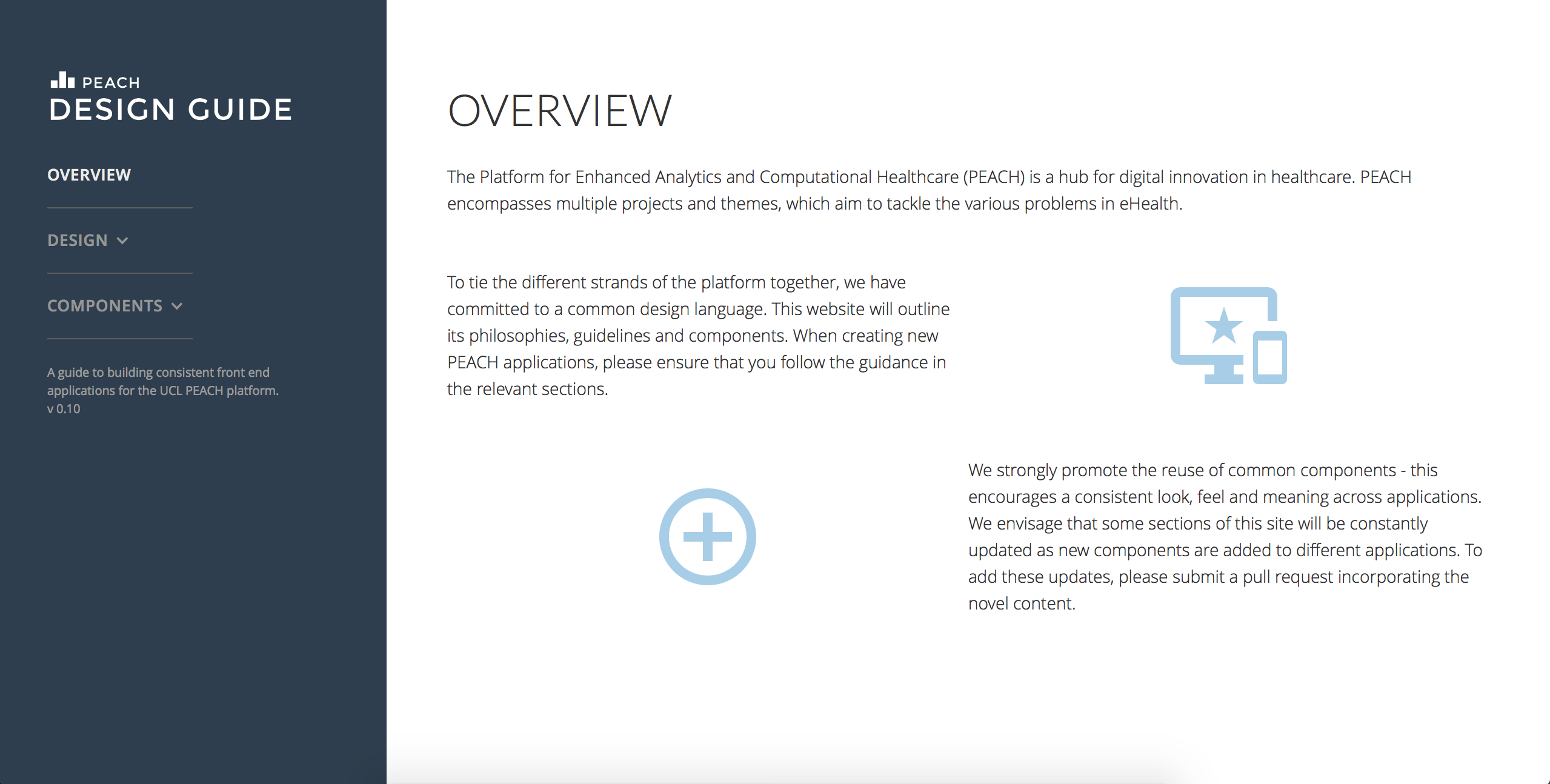
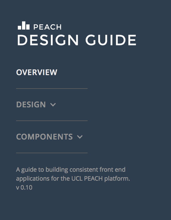
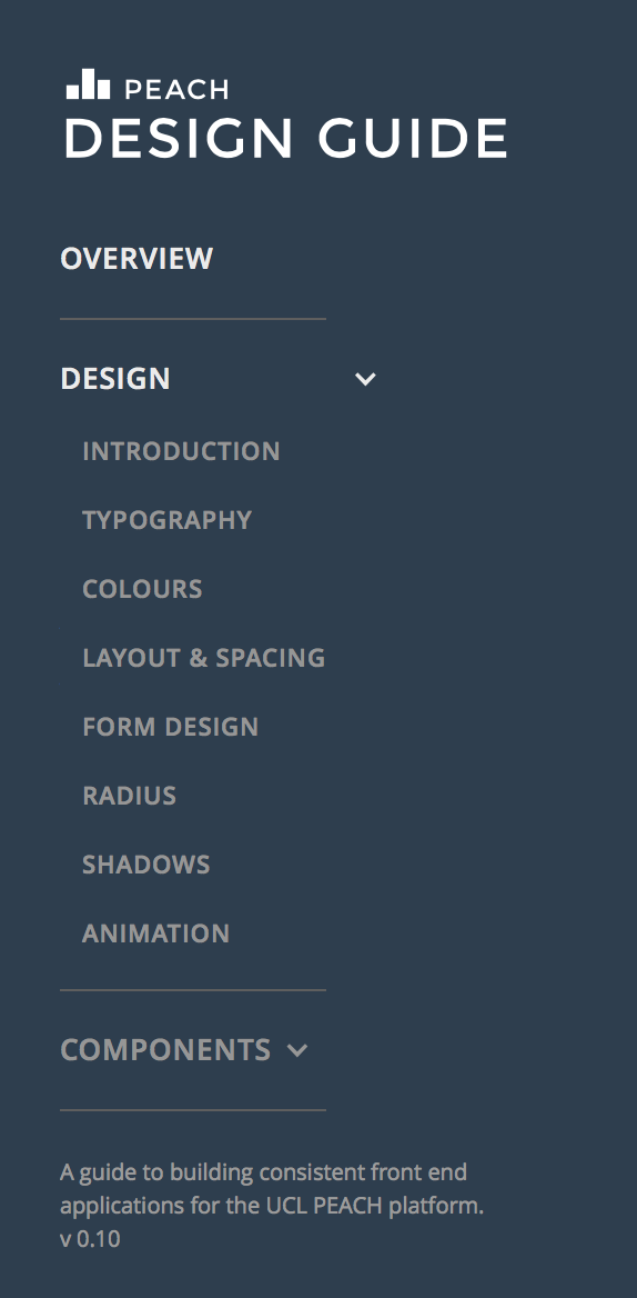
The menu at the left is the prototype provided. It is expanding the menu once clicked on the parent section as follows:
Click on any picture to expand.


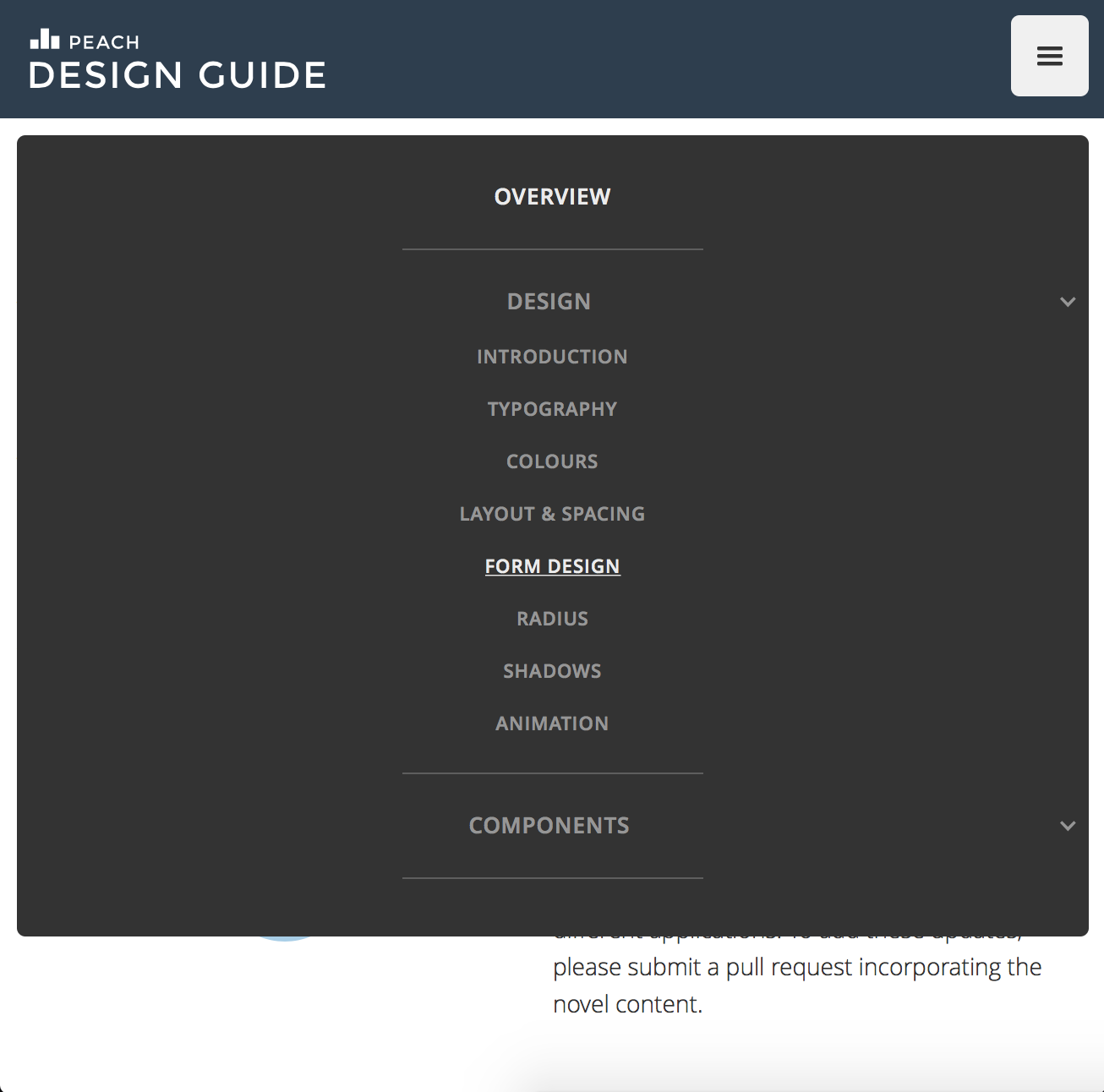
As a part of our contribution, our team is in charge of fixing bugs and performance issues. At the moment, however, the menu bar is optimised for a variety of devices, including touchscreen, and respective resolutions, including of those in mobile devices. This is an example of menu optimised for screens with lower resolution:
Our team was filling each section of the menu to the extent possible. For example, we have typography, colours, logos, buttons and much more available live on the website screenshots of which have been placed below:
Click on any picture to expand.
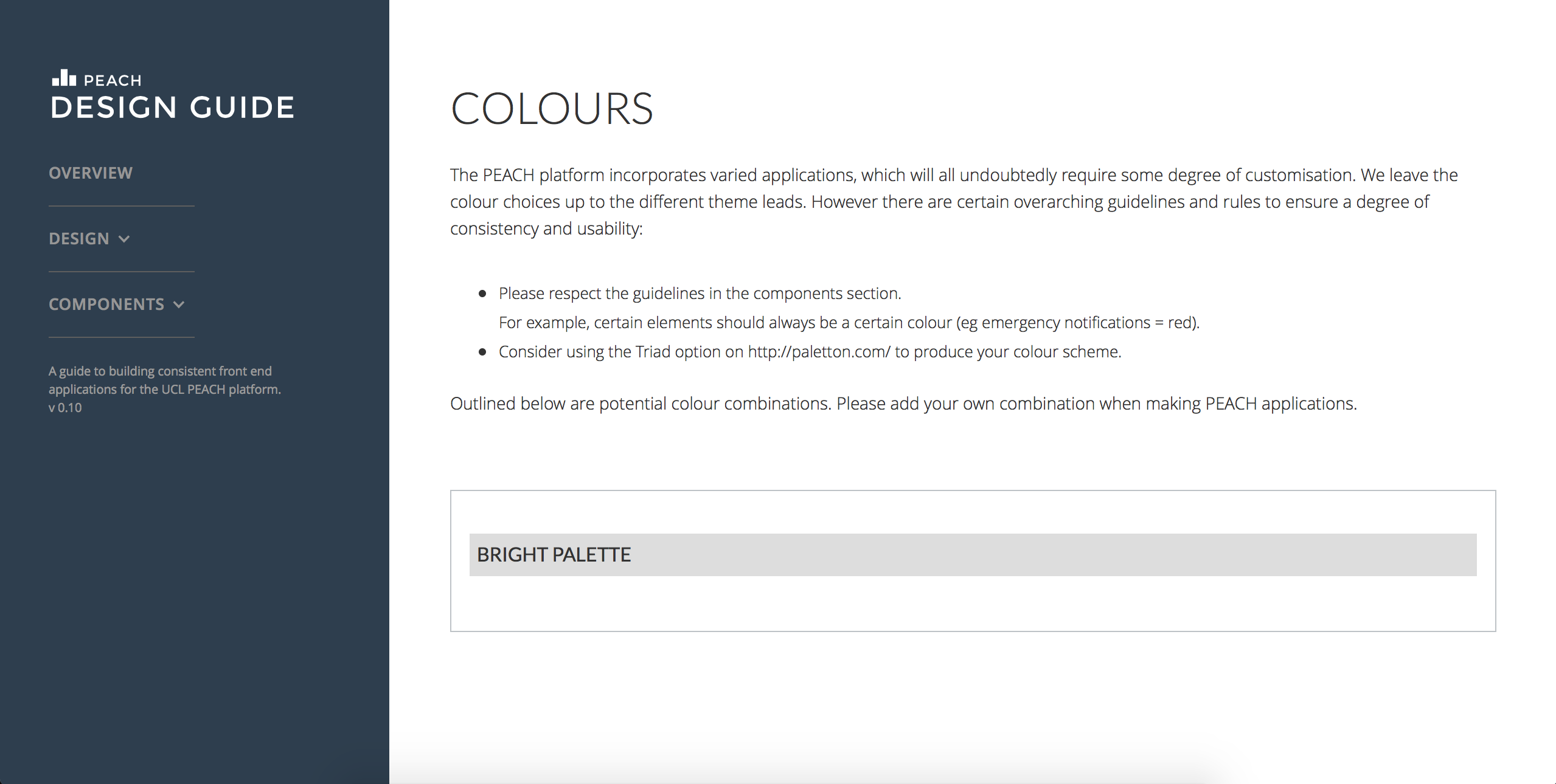
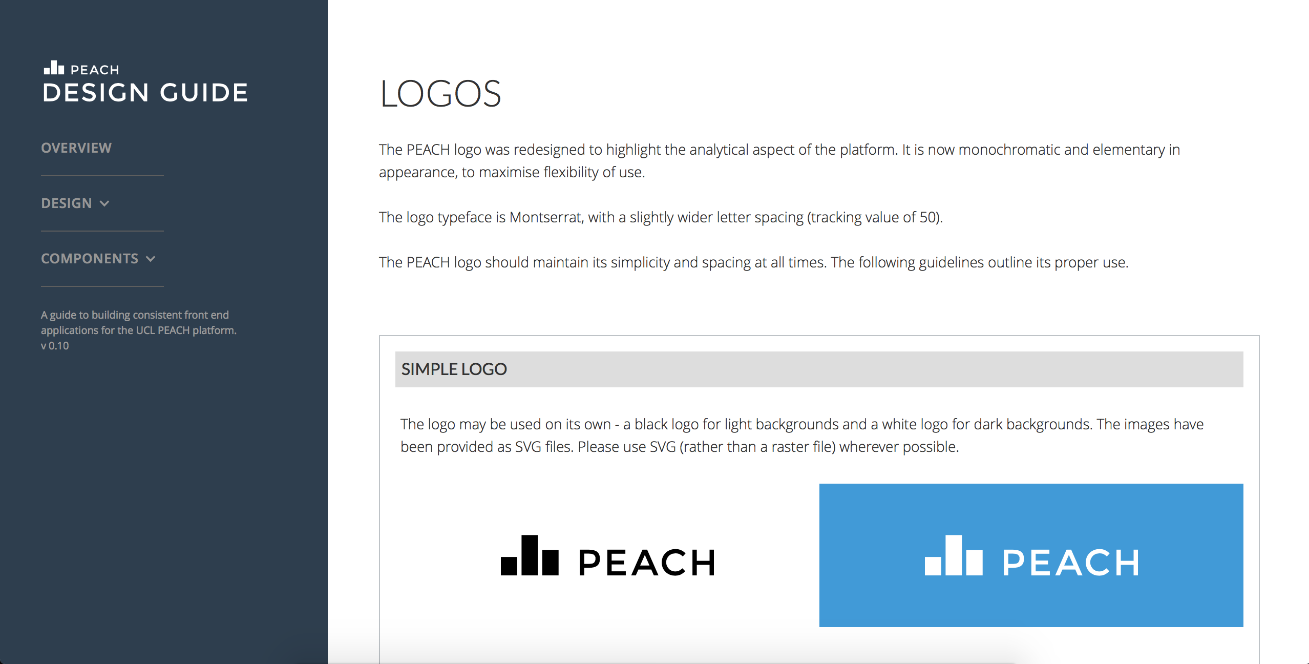
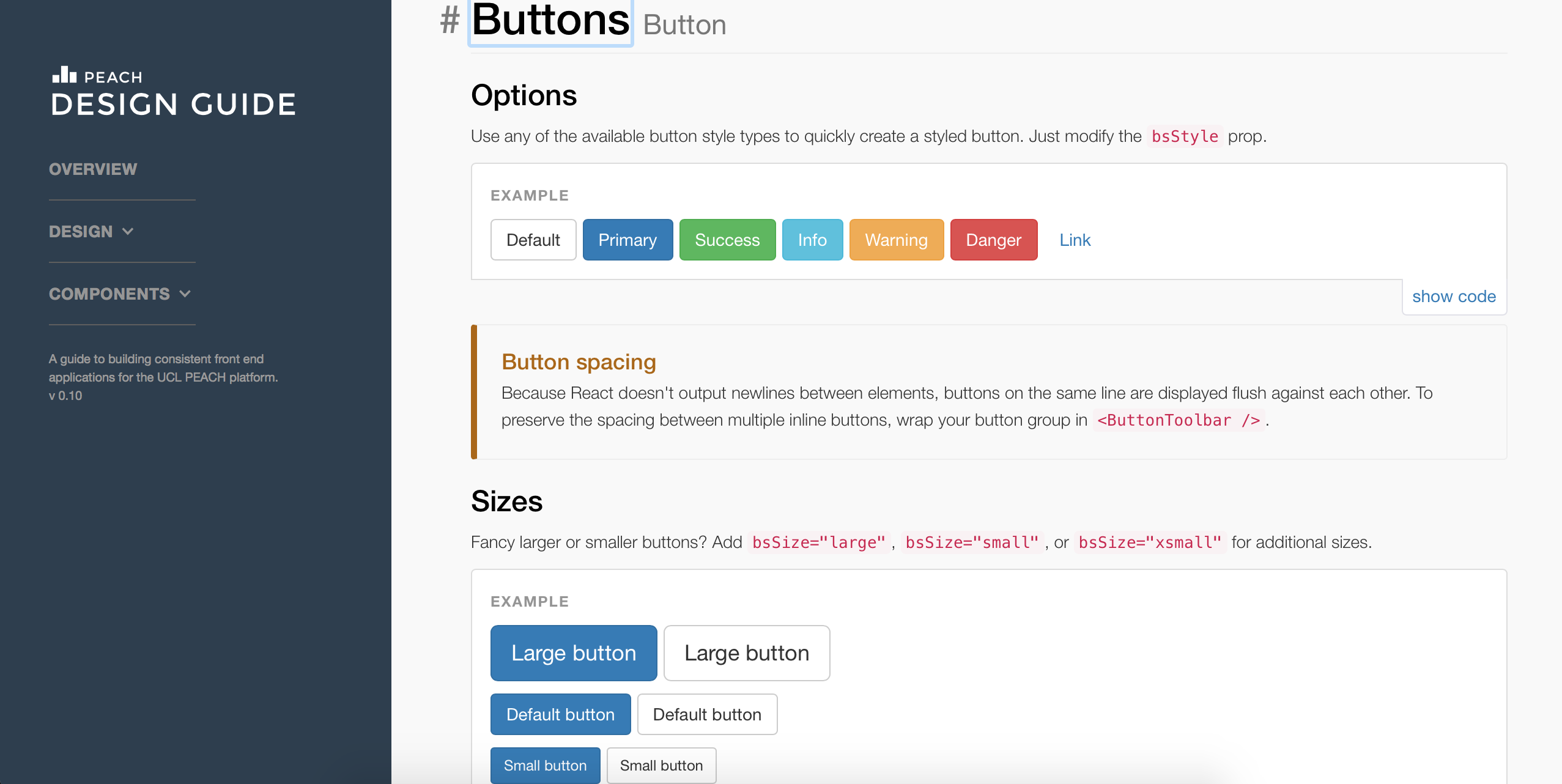
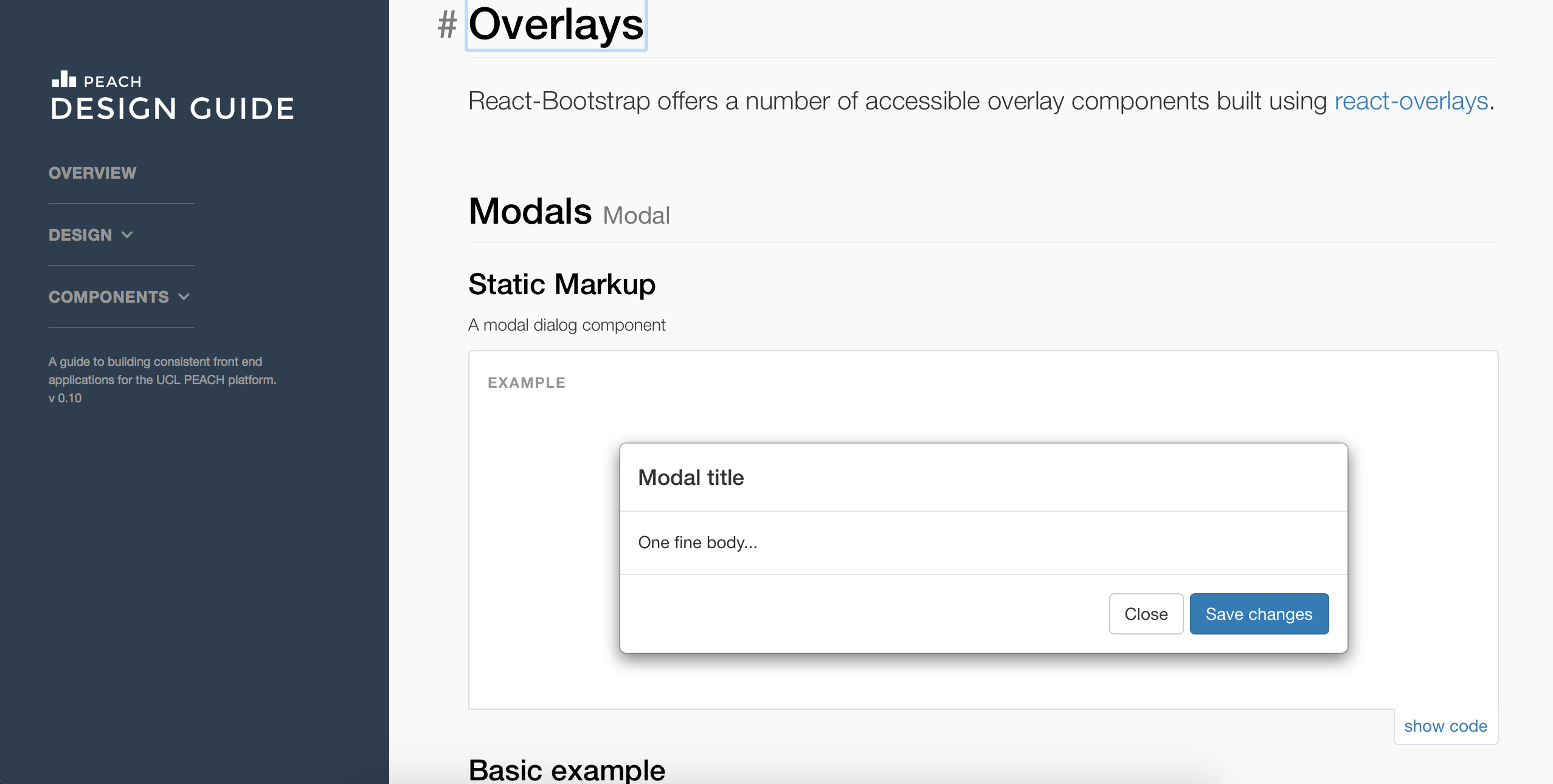
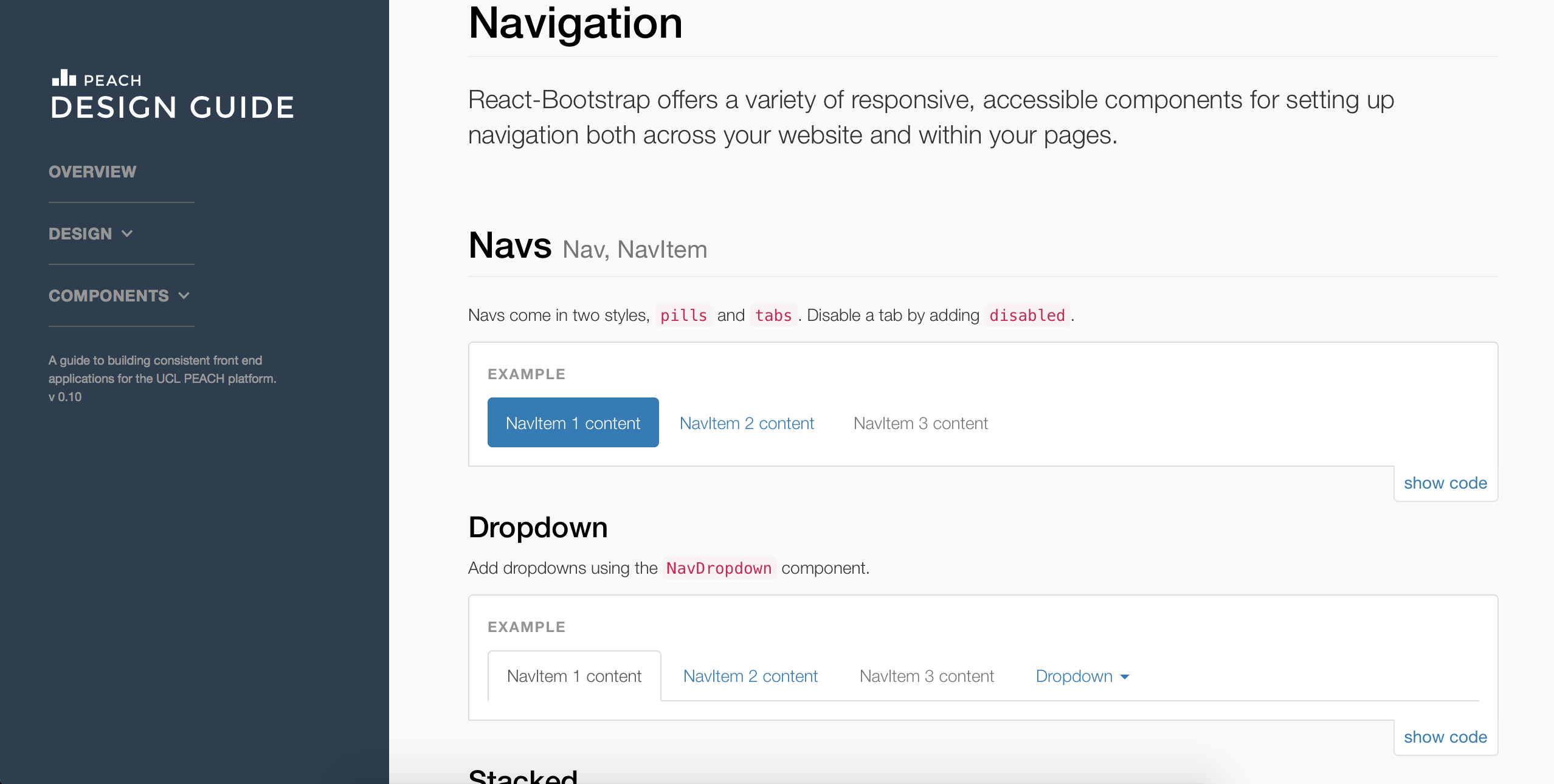
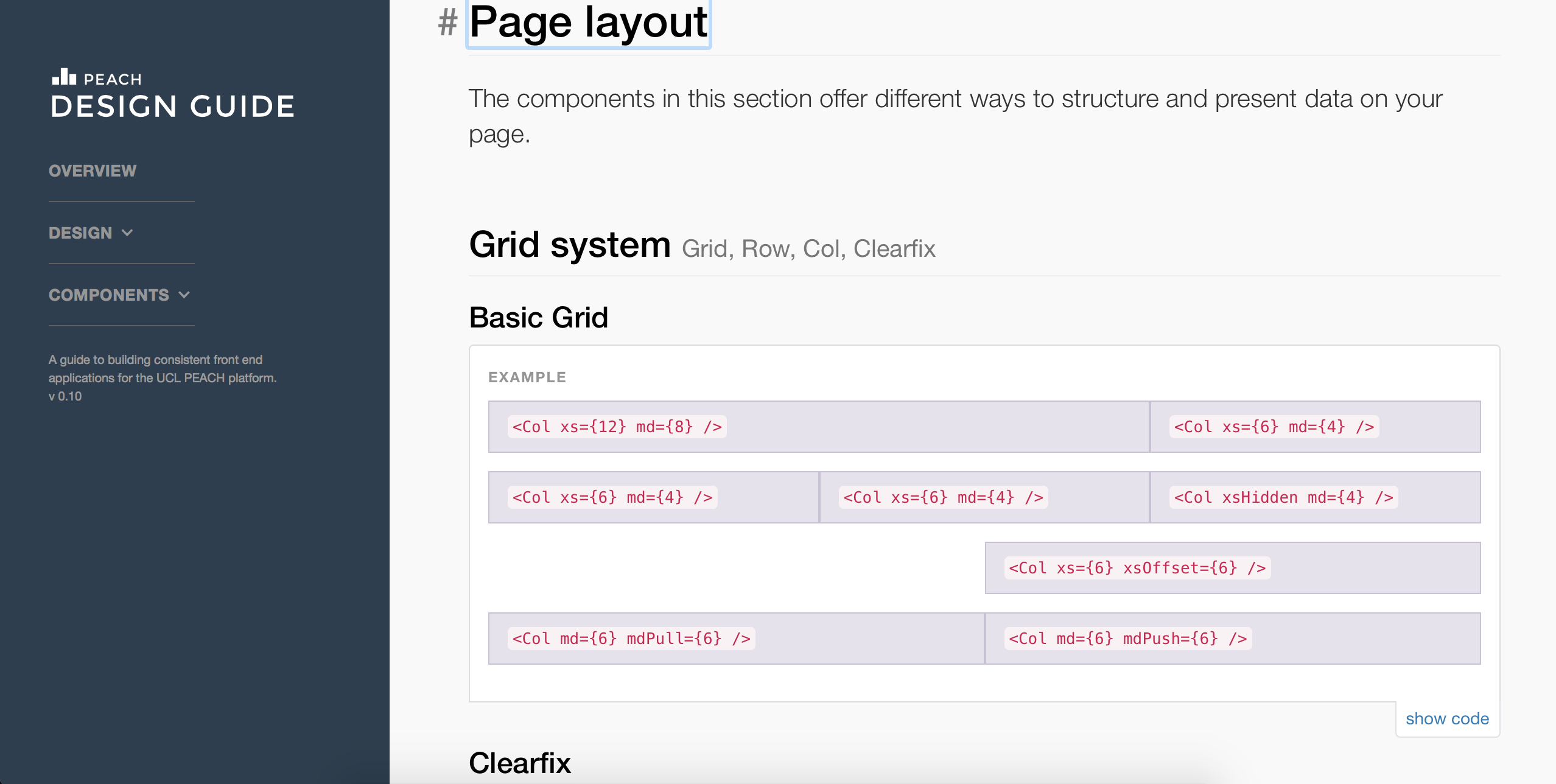
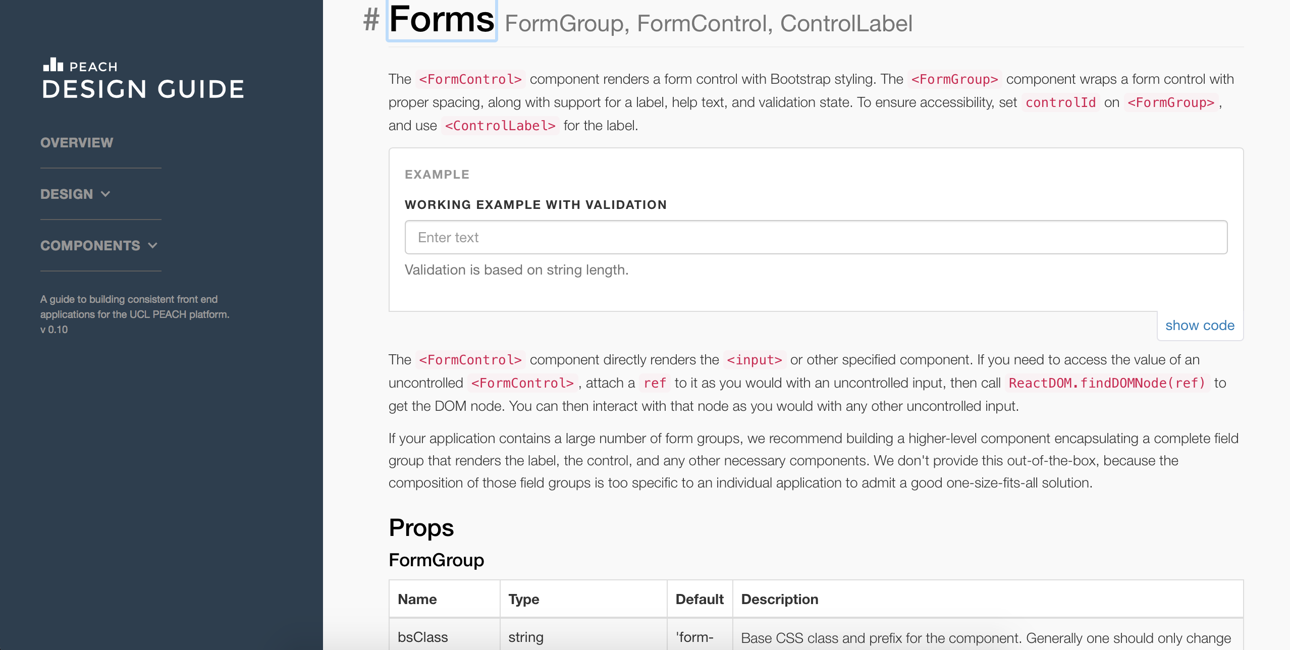
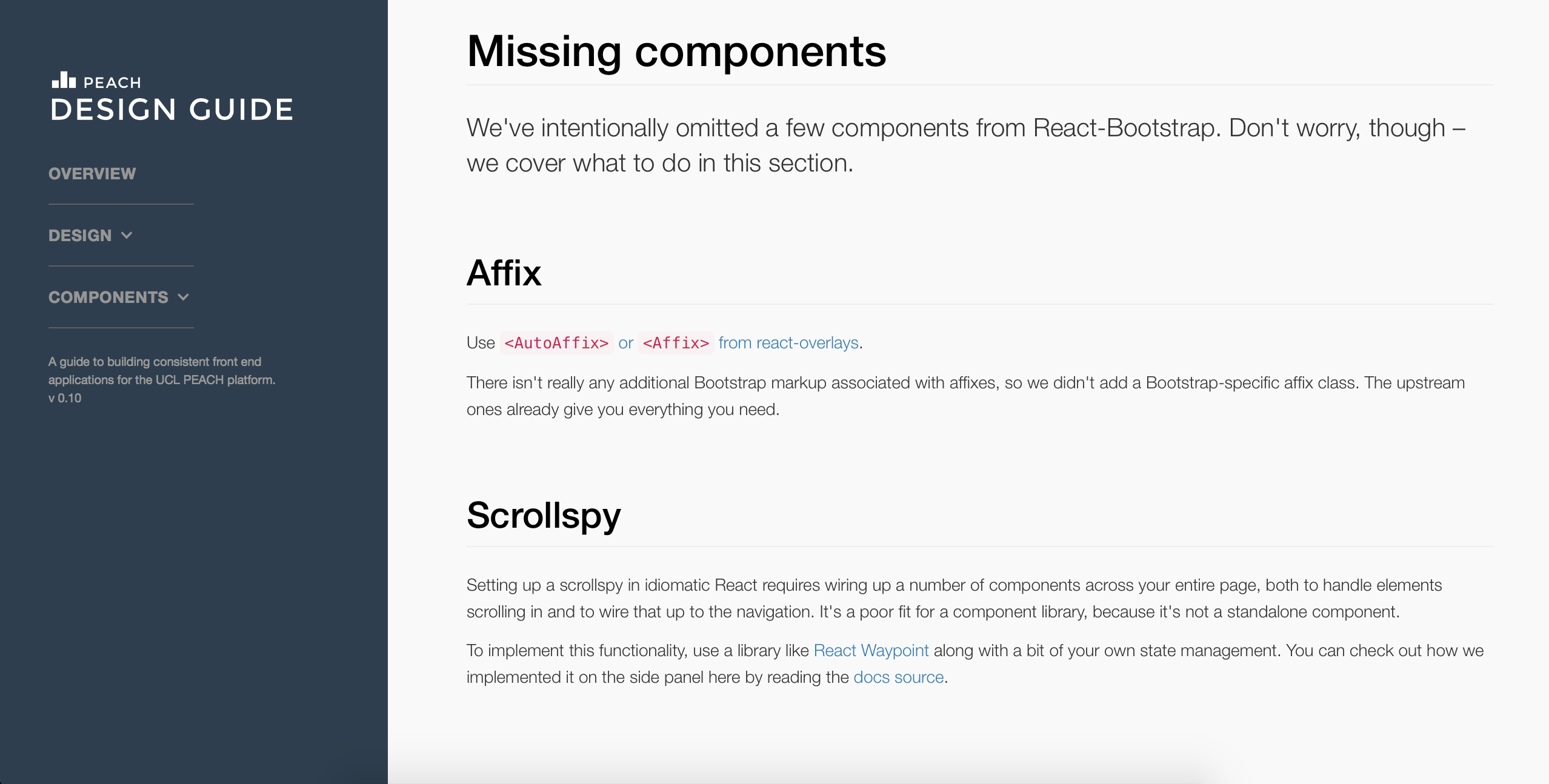
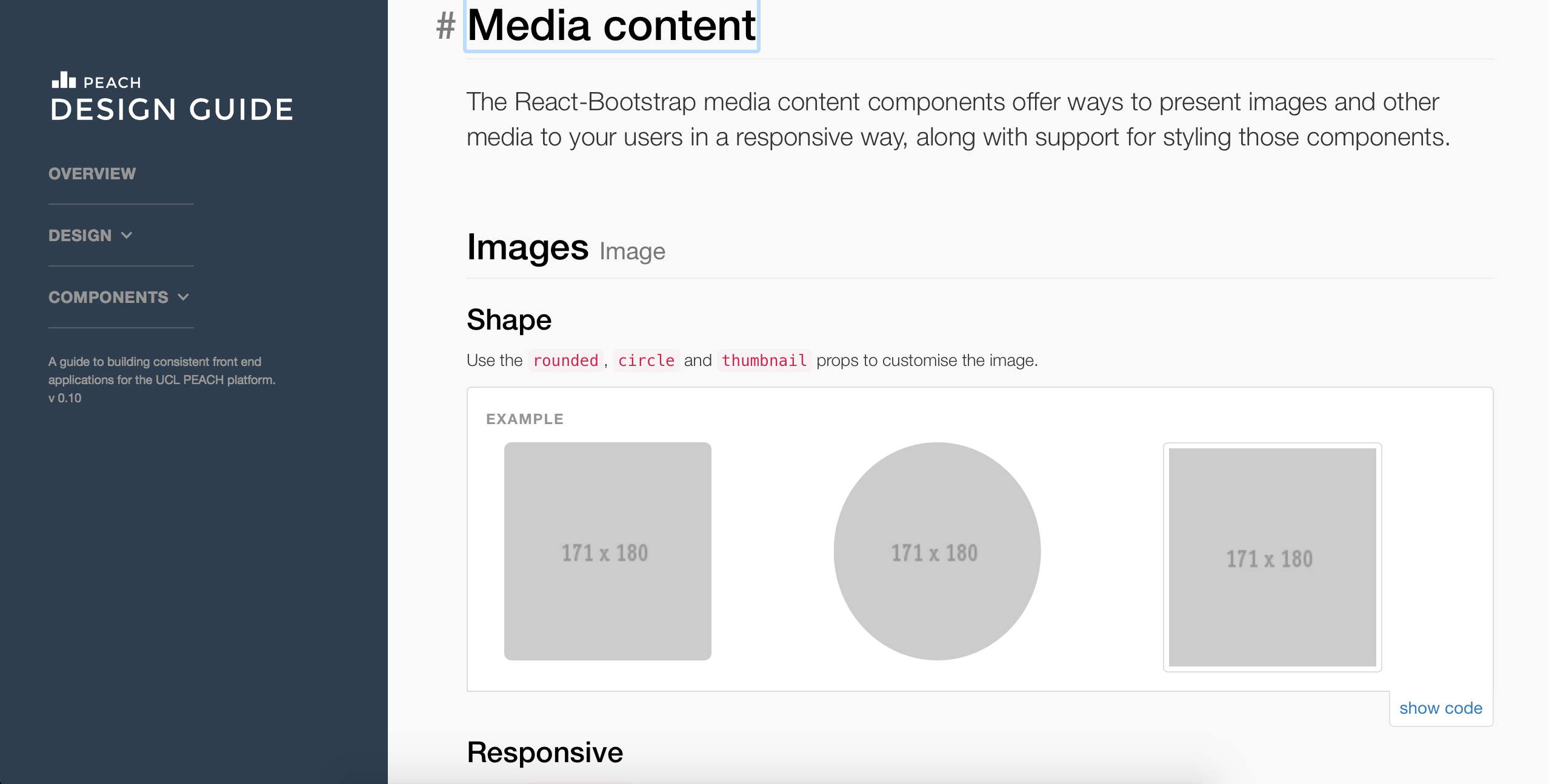
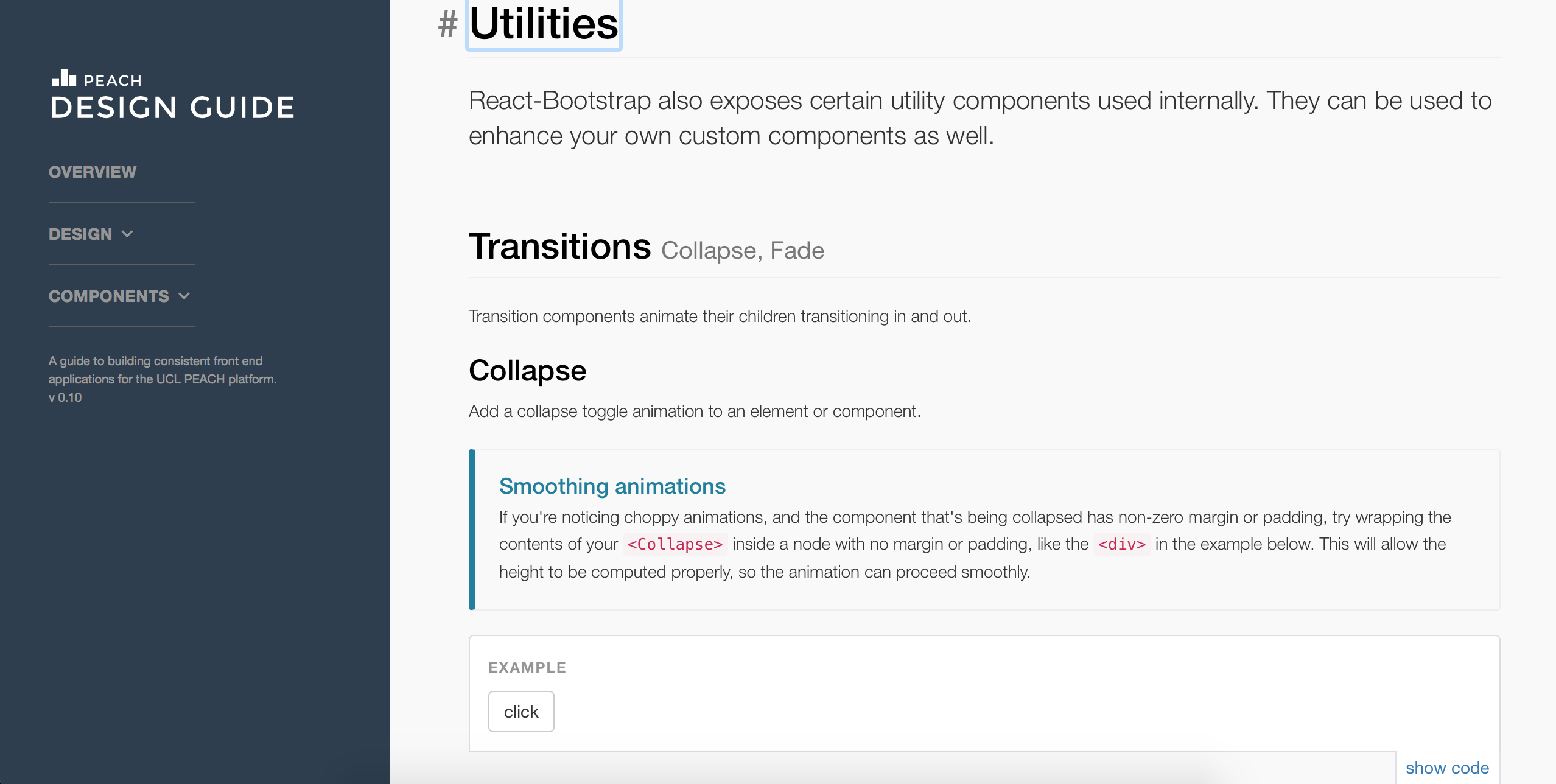


A lot more information will be added in the future, when necessary content and documentation are created.
The website is live and accessible to anyone interested in it, including our client. However, we have encountered a few bugs to be fixed in the next term:
